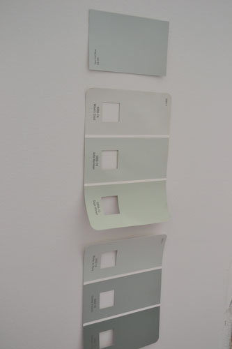
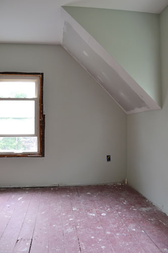
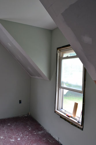
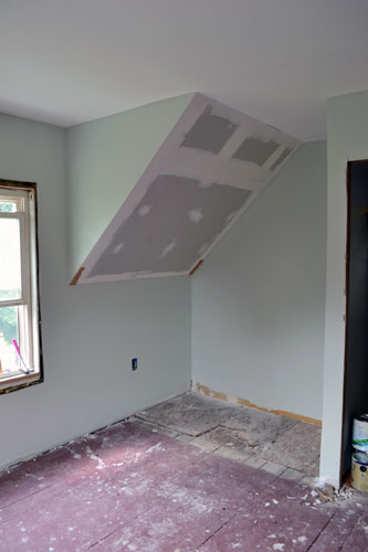
Over the last week, we have made some serious, SERIOUS progress in the master bedroom renovation. We’re talking there’s a slight possibility of moving back into the room this weekend…no joke. Thus, we’ve got some serious, SERIOUS updating to do with you. Next up, bedroom paint color decision time. We wanted a stony blue or green color so we picked up a few paint chip options from Lowes.
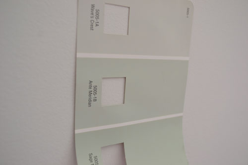
It came down to two swatches (both in the above pic): Sea Salt (very top) and Ante Meridian (third swatch down). And, based on the post title, I bet you’ll never guess what we picked. Yup…Ante Meridian by Valspar
The two colors were very similar. Both were a gray color but Ante Meridian had more green undertones compared to the blue undertones of Sea Salt. So we came home with a gallon in a satin finish, which has quickly become my new favorite finish for wall paint. It’s scrubbable. Enough said.
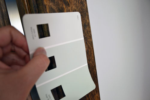
And almost forgot, we were also sold on the paint color thanks to how it look paired with dark walnut stain, which would be the stain of choice for all the trim in the room.
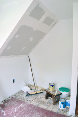
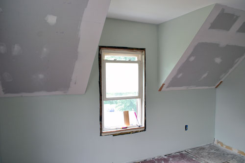
Before painting I had already slathered on a couple coats of primer on the walls. Well, all the walls except for the slanty parts which would be getting a bead board treatment instead.
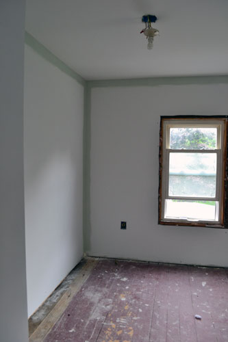
I started painting the room first but cutting in two coats of the wall paint.
After painting several rooms I’ve determined my optimal painting order: cut in two coats of the wall color, no taping (it slows me down), then roll two coats of wall color. It’s worked pretty well in the past and keeps me cruising right along like a tug boat. But one of those cute, hot pink ones. Those exist, right?!
And what wall painting post would be complete without a pseudo embarrassing photo taken of the painter doing the signature wall paint leg-pop pose. Note the appropriate painting footwear I’m sporting.
With two coats of paint slathered on the walls I was pretty gosh darn happy.
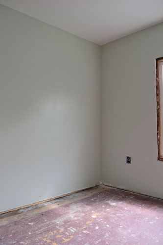
And totally loving the color choice.
It’s the perfect green for our bedroom. It’s not too green, not too dark, is still a neutral, and can totally be paired with my favorite red quilt without feeling all Santa Claus is coming to town.
I painted the room back on the Fourth of July and it took me the majority of the day to cut in two coats followed by rolling two coats.
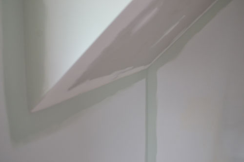
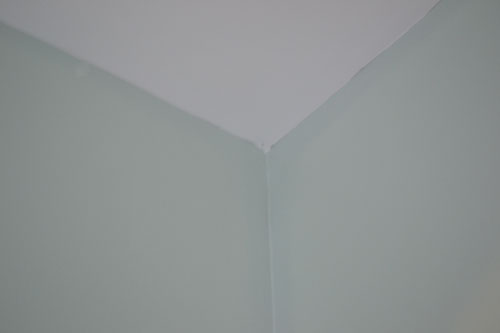
I was pretty happy with the paint color until it dried completely and I started noticing some two-toned-ness going on. It’s kind of hard to see in this picture, but it’s there.
This is probably the best picture I got of the two toned wall color, although it’s still hard to tell. It was WAY more obvious in person. If you look REALLY close you can see that the section of the wall I cut in is a few shades darker than the wall section.
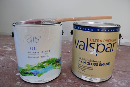
WTF? I was a little livid with how the wall color was turning out. Why was it doing this? Oh just let me tell you why. It was the tale of two paint cans. There was the old Valspar Ultra vs the new Valspar Ultra.
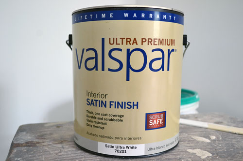
I had bought the gold labeled paint can (note…this is not the same exact paint…just imagine the same gallon in a satin finish not a high gloss…I had returned the can before I shot the pic) on a Monday, ran out of it on Wednesday, went to buy a new can that day, and learned that Valspar had changed their paint formulas. The lady at the paint counter assured me, despite my concerns, that the new Valspar Ultra was the exact same product as the old Valspar Ultra. Ummm…no. It dries much lighter meaning the areas I cut in twice with the old paint formula was darker than the the areas where I rolled the paint. After much complaining to the Lowes customer service desk I got my money refunded on the original can and then marched my butt back home to cut in all the paint once again. But anyway, the room is painted, although I’m starting to feel like the room reno is cursed. We’ve had problems up the ying yang with this room from unsquare-ness to paint problems, and falling off ladders. Yes…I have taken TWO count ’em TWO diggers off the ladder in this room. I thought I broke my shin on the last great fall but just some swollenness. Just call me Jumpty Dumpty. Needless to say I’m ready for the room to be done-zo! Soon enough…soon enough!
Pssst…Thanks to all you newbies for stopping over from the Pinterest Challenge today! You guys rock!

Love the color. That’s what we have in our stairwell. Great choice.
Thanks Pat! We’re totally loving it too. And it reads so much better in person than on the computer screen.
I’m so glad you posted this! I have been looking for the perfect sea spray color and bought a sample of Valspar’s sea salt blue. I loved it, but right before I left my house to go buy a gallon, I looked at the wall and said, “Nope, too blue.” Went to Lowe’s for more samples, and the only one that looked kind of sea spray-ish was Ante Meridian. Brought the sample home and loved it but wasn’t sure if it was going to be too light. After seeing your pictures, I think Ante Meridian will be PERFECT!
Oh yay! I’m glad to be of help! We actually had the same feeling about this paint color…it was just the perfect (non-cheesy) sea spray like paint color. We adore it still to this day. Let me know how your room turns out!!!