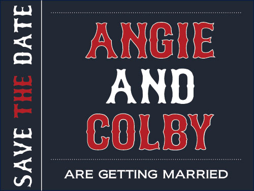
So remember back when I mentioned that we were oh so close to being ready to send out our save the date cards? Well, apparently that wasn’t true. I’ve been sitting on this project (figuratively…not literally…sheesh) for quite some time now and it’s high time I make a decision. I am about to present to you four prototypes for Colby and I’s save the date cards for our wedding next summer, designed by moi via InDesign. I expect each and every one of you to comment on which design is your fave or you fail the “Save The Date” challenge. No makeup points, no extra credit, we’re talking hard core definitive failure. I kid I kid! But seriously, did I scare you into commenting? You know…sometimes the scare tactic works! Anywho, I bring you save the date option numero uno:
I have to admit, option number one is not completed. There would also be a back to it with more information about our wedding (similar to what you will see in options two and three). The important part to note here is that this is a two sided save the date.
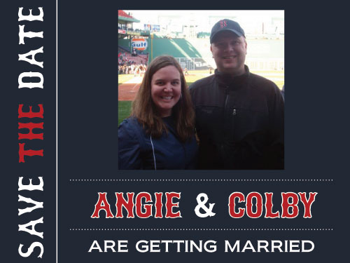
Now to option number 2:
Again, this option will also have a back side with more information about our wedding.
Next on the docket, option number 3:
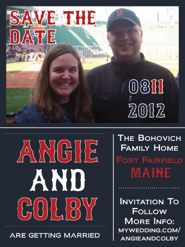
Are you starting to sense a theme here? We definitely went with a baseball themed, more specifically Red Sox themed, save the date. Even though the Sox went through the most epic crash and burn in history (at least during my lifetime) we still love them. Both Colby and I treasure some fond Fenway Park memories including some serious Green Monster shenanigans…great story and probably one of the best days of my life (shout out to Steve and Heather for also sharing that game with us…what fun…I cannot confirm nor deny that we may have been asked to leave by security after an hour long photo shoot atop the monstah). But back to the save the dates. This option, option number three is not a two sided card like the first two but all the info is jammed onto the front. The back would be empty.
And finally option number 4:
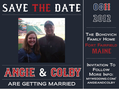
This option is pretty much the same as number three just with a different orientation.
A few other points to note and tidbits of info for you. The picture of Colby and I at Fenway was taken a couple of years ago at one of our first games together. It is the only, I repeat ONLY, picture of the two of us that we actually look normal in. For the most part we’re pretty normal people. That is until there’s a camera in front of us. Then I feel the need to show you ALL of my teeth and Colby chooses the squinty, am I here, cuz I don’t think I’m here look. It’s attractive! We didn’t really want to shell out dough to have professional engagement shots and decided to just use a pic of us that we already had and treasured and represented a great moment. Thus, this picture won hands down.
Secondly, I also wanted to introduce you to 1,001 Free Fonts. It’s my favorite font website. I use it all the time when I’m looking for a fun and decorative font. Ironically, I didn’t use that site to find the Red Sox styled font in the save the dates. I picked it up on a similar site I found via Google. But for all of you wanabe desk top publishers out there attempting to make and print your own save the dates, a font website may just be your new best friend.
So…..whatta ya think?! Is it option number one, the simple, basic option? Or is it option number two, the double sided card with added photo pizazz? Or could it be option number three, a one sided card with a photo and vertical orientation? Or even option number four with its photo, double sided-ness, and a horizontal orientation? I don’t know…I don’t know….we’ll see what you all think first!
Pssst…I’m serious, comment away! Option one, two, three or four…who do you think is the winner? If I was a bigger, cooler blog (not the dorky one in the corner) this would be where I would have a contest and one of you commenters would win a prize. But alas, I’m a novice blogger. Let’s see…let’s see….I can offer up kuddos? How about that?! One of you lucky commenters will win a GINORMOUS basket of kuddos from yours truly! I know…totally makes you want to comment now!


Option 3! I love how it looks the most like a ticket!! And I love this picture of you guys.
(don’t tell John, but I also had a great time at a Red Sox game!!)
Ooooh….I’m pretty sure I need to hear that story!
I like option 3 the most. They all look good tho!
Yes! Don’t tell…but option three is also my favorite. And according to Colby, whatever is my favorite is also his favorite. Good man…good man! Hope all is well at casa de Prill! And I also checked out your blog…nice work fellow blogger!
Option #3 for me. However, the date looks a little confusing (the 0811). I like the larger picture and the info on the front.
Ding ding ding! Winner winner! Yeah, I’ve thought about switching the date up a bit. I’ve heard that it’s confusing from another person as well. But you were able to figure it out, right?
Dear Granddaughter:
I like option 3. The picture is clearer and I can see your face features better. However, whatever you choose will be just fine.
Thanks Grandma! Love you!!!
Totally love #3.
Yay! Option three seems to be the general consensus…and also my favorite! Thanks for the feedback…you rock!
Hi Angie, I also like #3, and I must say, your boyfriend has a huge head. Who did he inherit that from??
Hmmmm…perhaps from the same person that he gets all his charm and wit from?! You know…the same person that he inherited spider dog/cat from?! Just a guess! But it’s probably just a freak of nature thing!