After MUCH deliberation, the girls and I finally selected a paint color palette for the playhouse. Introducing our playhouse paint colors. They’re fun, bright, and include everyone’s color choices.
The Process For Playhouse Paint Color Selections
The process of choosing a paint color was a bit much. And by a bit much, I mean that instead of it taking a few days, like I expected, it took us WEEKS. Let me paint a picture of what it looked like at our house for the last few weeks with conversations looked something like this. For the record, at the time, Bea was three, just days away from turning four, and Rowan was 8.
Me to the girls: “What color do you want the playhouse?!”
Beatrix: “Pink!”
Rowan: “Yeah, pink sounds great.”
Me: “So like a bubblegum pink with white trim, does that work?”
Both Girls: “Yes!”
Then I proceeded to pick a few bubblegum pink paint colors from my swatch deck that should go well with the brown shingles on the building, along with the white trim paint I already have (it’s our existing house color and the same color we painted the playground). I show the paint colors to the girls, thinking they’ll sign off on it. One of the pinks is the one we ultimately chose in the photo below.

Beatrix: “Yeah!!!”
Rowan: “It’s okay.”
Me: “Just okay? What would make you love it? Something brighter? Or a little lighter?”
Rowan: “How about purple! Like maybe a light purple with dark purple trim.”
Me: “Okay, I can get behind that. Let me see what purple colors we could do.”
Again, I go about picking a few purple shades that go well together and look good with the shingles. I take the paint colors to the kids once again for their approval, only to receive these reactions.
Beatrix: “Yeah!!! It looks like a princess house.”
Rowan: Always the pragmatic one. “You mean a princess castle, Bea.”
Me: “Yes Rowan, but what about the colors? Is this what you wanted?
Rowan: “Uhhh…I was thinking maybe rainbow.”
Me: “Rainbow?! What happened to purple?”
Rowan: “Well, maybe it could be pink and purple.”
Bea: “And BLUE!”
Me: “Bea…what do you think of a rainbow playhouse?”
Beatrix: “Yeah, but maybe it could be pink.”
Back to the drawing board. Lather, rinse, repeat about 100 times. I’m not exaggerating. Okay, maybe a little. I should probably share all the color combinations I attempted to gain approval for because we came up with some doozies! Actually, I’m going to do that. It would make for a really fun blog post, and maybe, just maybe, it could help someone else choose a playhouse color palette with their children. Especially creative, opinionated children like mine.
Also, can we take a moment to appreciate Beatrix’s love of ALL the colors? I adore her. But one thing she made abundantly clear throughout the entire paint color choosing process was that the playhouse had to include pink. Here are the colors we ultimately landed on one more time.
How To Get Kids To Decide On Paint Colors
I truly want to incorporate my children’s opinions and let them have agency over their rooms and spaces. Well, within reason. Will I let them knock down a wall? Or hack a vintage family heirloom to create a hidden door? Nope. But I will forever let them choose their paint colors and hang whatever they want on the walls. But I also don’t want the playhouse to be an eyesore for me and Colby. From the outside, I want it to look good in the yard. Inside, they can go nuts once it’s all done.
This is partly why the process of choosing and committing to paint colors is so hard with children. They change their minds ALOT. We must have explored at least 20 or 30 different exterior paint color options before I finally gave up and decided we needed a different way to decide.
Use Visual Aids
I should have known I needed to approach this paint color decision with visual aids. Especially after all the indecision with the girls’ shared bedroom. I should have known that I couldn’t explain to them “bubblegum pink with white trim” and that I really needed to show them what it would look like. Then they could tell me, “a little darker here” or “maybe not this color there.”
That’s when I created a quick, super rough Photoshop template that I could use to “paint” our playhouse digitally and explore some color options. For the record, you can also do something similar by uploading a photo on the Benjamin Moore website and using their color picker tools.
The sketch was super rough, but it helped the girls visualize how the walls would be pink and the trim white, then the floor would be a dark blue/green, and here are the accent colors we’re using for the shutters and window boxes. The visual representation of how it would be painted, along with the exact colors, helped so much, and I officially got a sign-off from both kids.
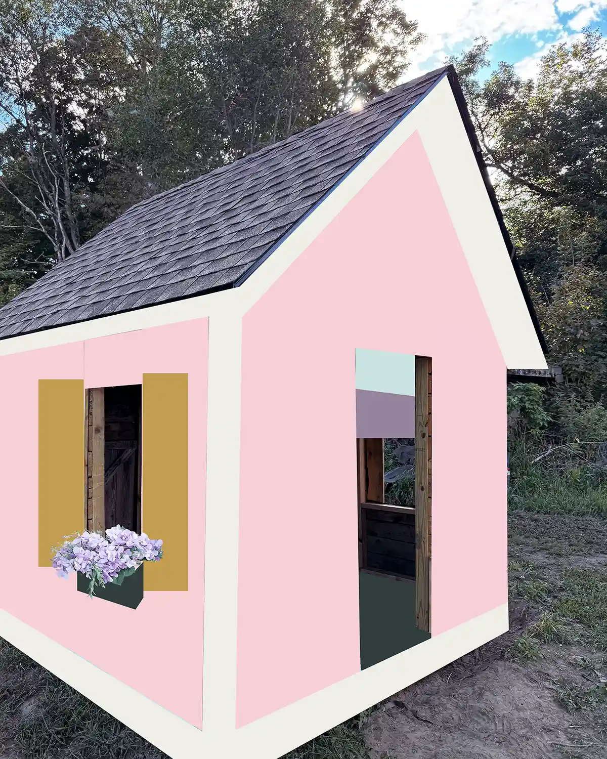
I may have run to the store immediately after their sign-off, so there was no time or budget for them to change their minds. Paint is expensive these days and non-returnable, so we are committed, and they know it.
Meet Our Playhouse Paint Color Palette
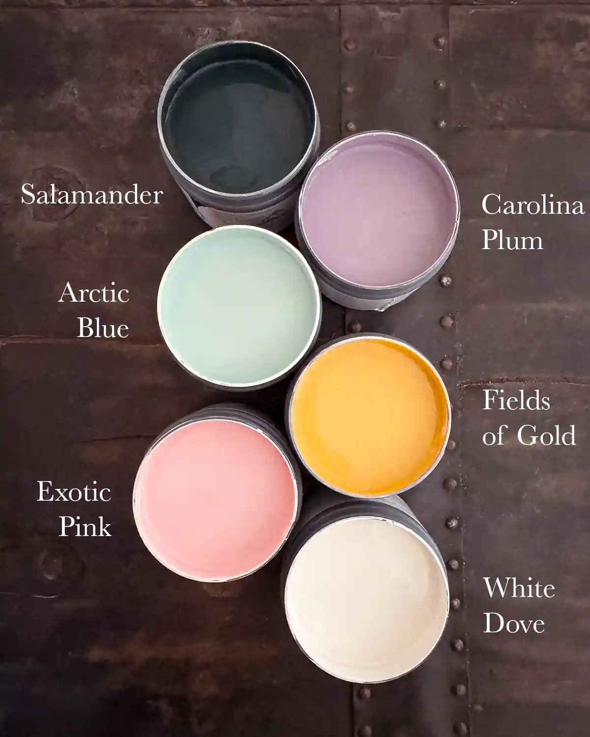
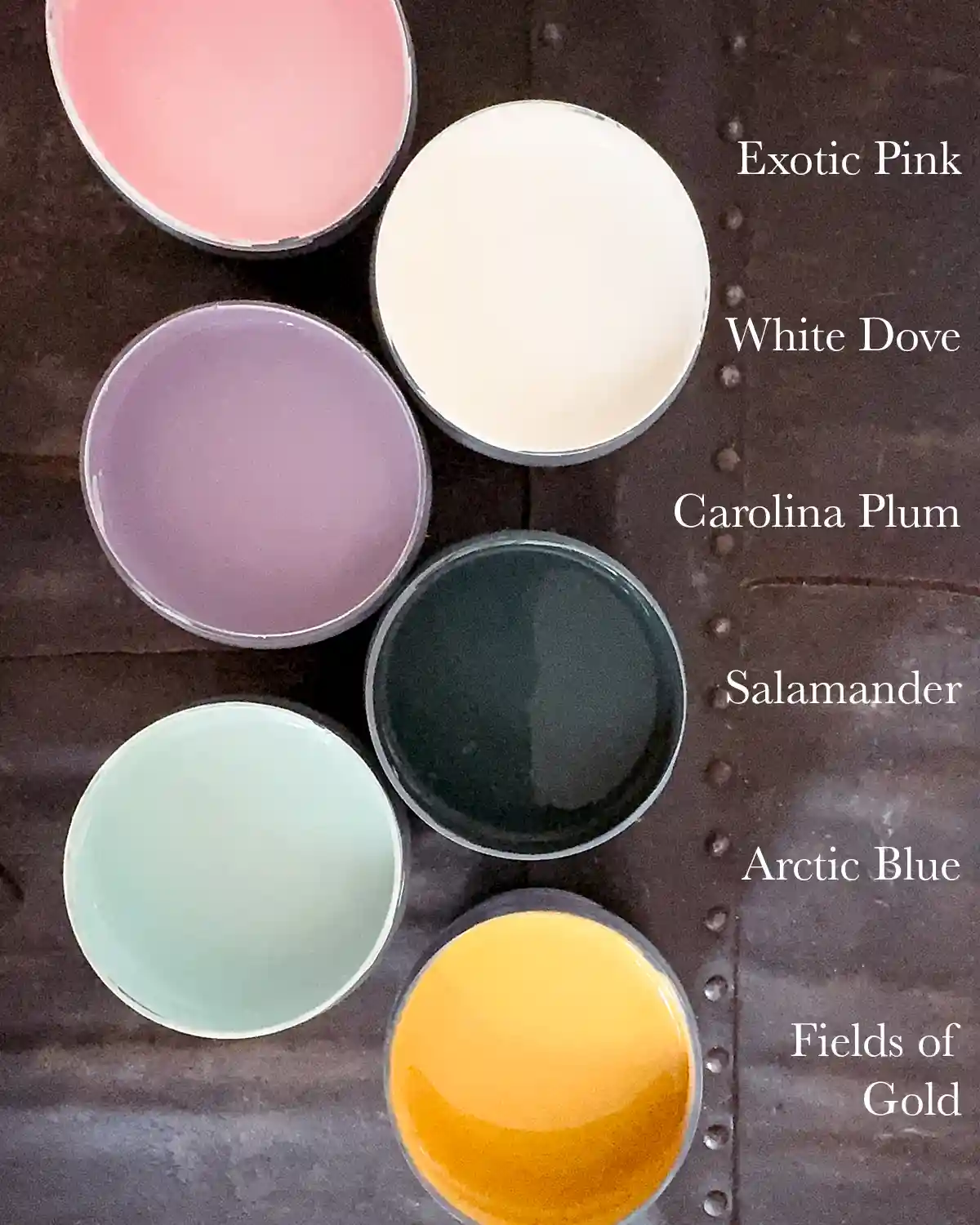
The playhouse color palette is a mix of six colors, all from Benjamin Moore. Our kids really couldn’t commit to just a couple of colors, so we’re going for a colorful rainbow palette. The colors include Exotic Pink, White Dove, Salamander, Arctic Blue, Carolina Plum, and Fields of Gold.
Exotic Pink For Exterior
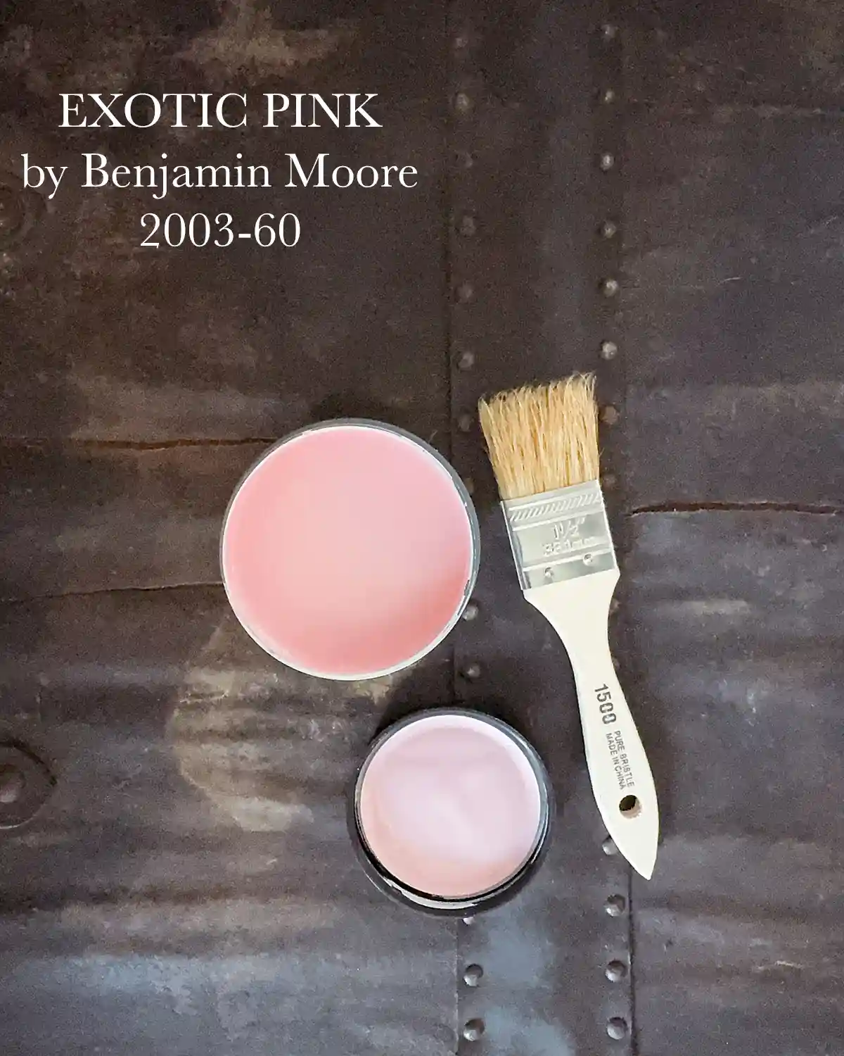
The main star of the show is Exotic Pink 2003-60 (Benjamin Moore) for the exterior walls. Of all the main exterior colors we explored, this one was the most loved by us all. It’s brighter than what I would have chosen. I still believe that a lighter pink would look better with the shingles, but the girls wanted brighter. This shade was our compromise. You should have seen the shade they REALLY wanted. Think eye popping bright! I also think it will look adorable in our yard. A pop of bright pink. Can you envision what it will look like with flowers growing all around the building?!
White Dove For Trim And Interior
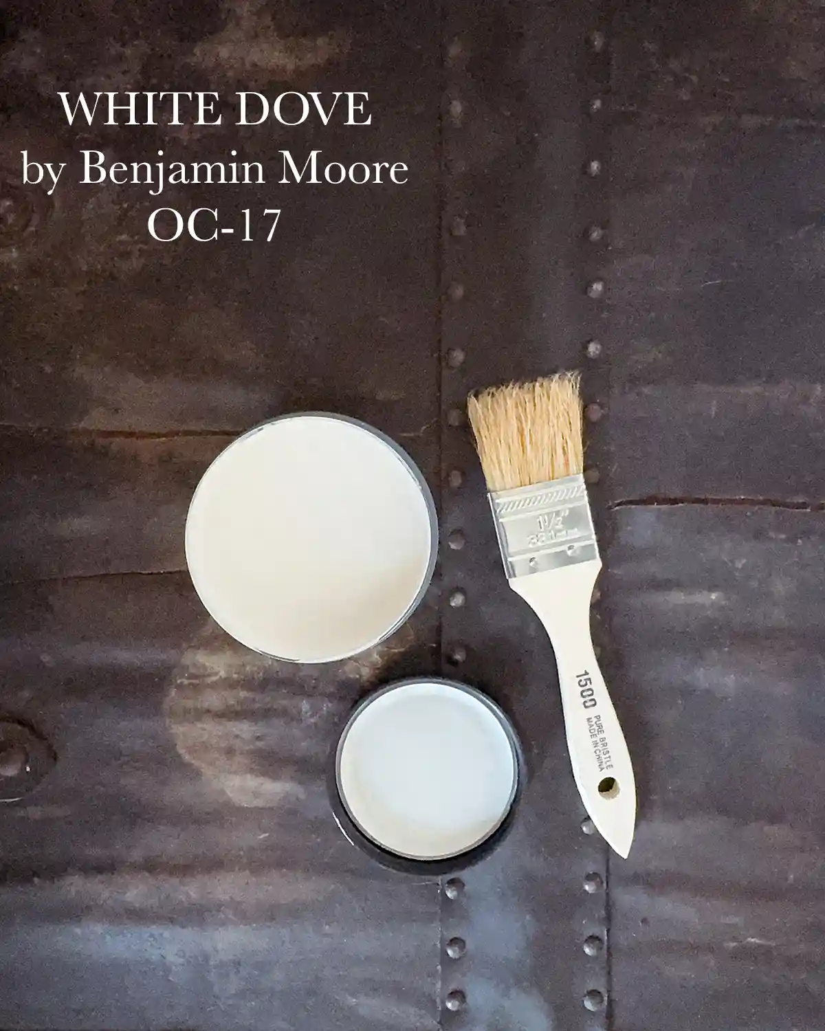
One non-negotiable for me was somehow incorporating White Dove OC-17 (Benjamin Moore) into the exterior mix. It’s the shade of paint we used for the exterior of our home, and I always love when a playhouse nods to the main house in some way. It’s even more adorable, in my opinion, when the playhouse is a mini-me of the family’s home. But no way would the girls ever let me paint their playhouse white. They’re still pretty upset with me about the playground being white. There’s a slight chance I’ll cave next summer and paint it.
I also plan to paint the interior walls White Dove. It will be a great background color for all kinds of colorful items and accessories we have planned for the interior of the playhouse. Like a colorful table, rainbow-painted ladder to the loft, kid art hanging on the walls, rock collections, cut flowers pillaged from my garden, and more.
Salamander For The Floor
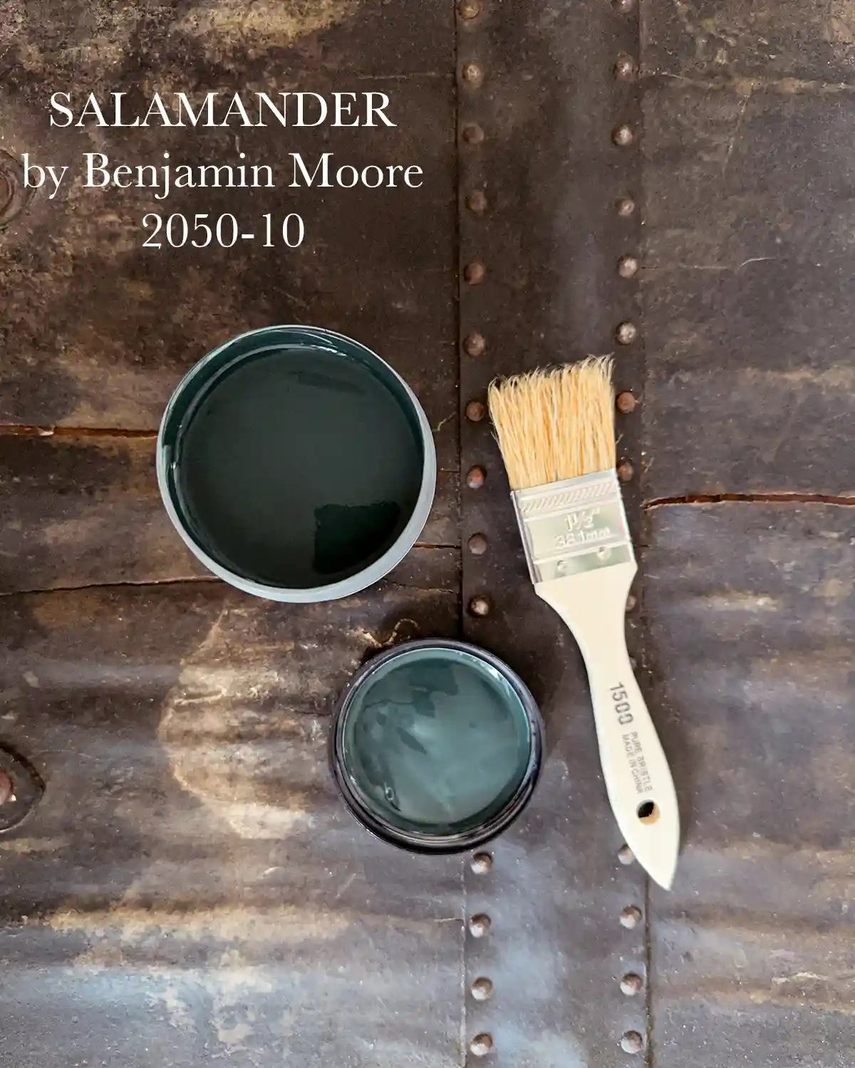
I love the idea of a dark painted floor in the playhouse to ground and balance out all the bright colors. Salamander 2050-10 (Benjamin Moore), a dark blue-green shade, fits the bill perfectly. I love that it’s not a black or brown, bringing in color while also being neutral enough to let the other colors shine.
Arctic Blue For The Ceiling
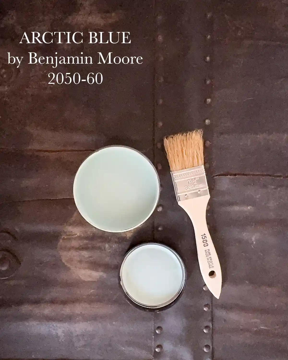
I’ve always loved haint blue porch ceilings; we had one in our first home, and wanted to bring that same idea into the playhouse. It was a great way to fill Bea’s need for blue in our rainbow playhouse. The goal was to find a light blue with slightly warmer or green undertones. The white paint is warm-toned, so I wanted to try to keep everything cohesive. Arctic Blue 2050-60 (Benjamin Moore) is that light blue with green undertones, and it works well with White Dove and Salamander.
Carolina Plum For The Loft

If it were up to me, there would be no purple included in the paint palette, but when you’re eight, purple is a necessity. The goal was to find a warm purple color that’s similar to a pair of light purple outdoor chairs that the girls use on their playground. I like the connection a similar shade would make between the two structures, which are right next to each other. The solution, Carolina Plum 1384 (Benjamin Moore) for the loft. I’m currently lobbying hard for white ladder sides with rainbow steps of all the colors used in the playhouse. But the girls just don’t get my vision. But wouldn’t that look good?! Maybe I’ll do it on the playground to give it a little more color.
Fields Of Gold For Accents
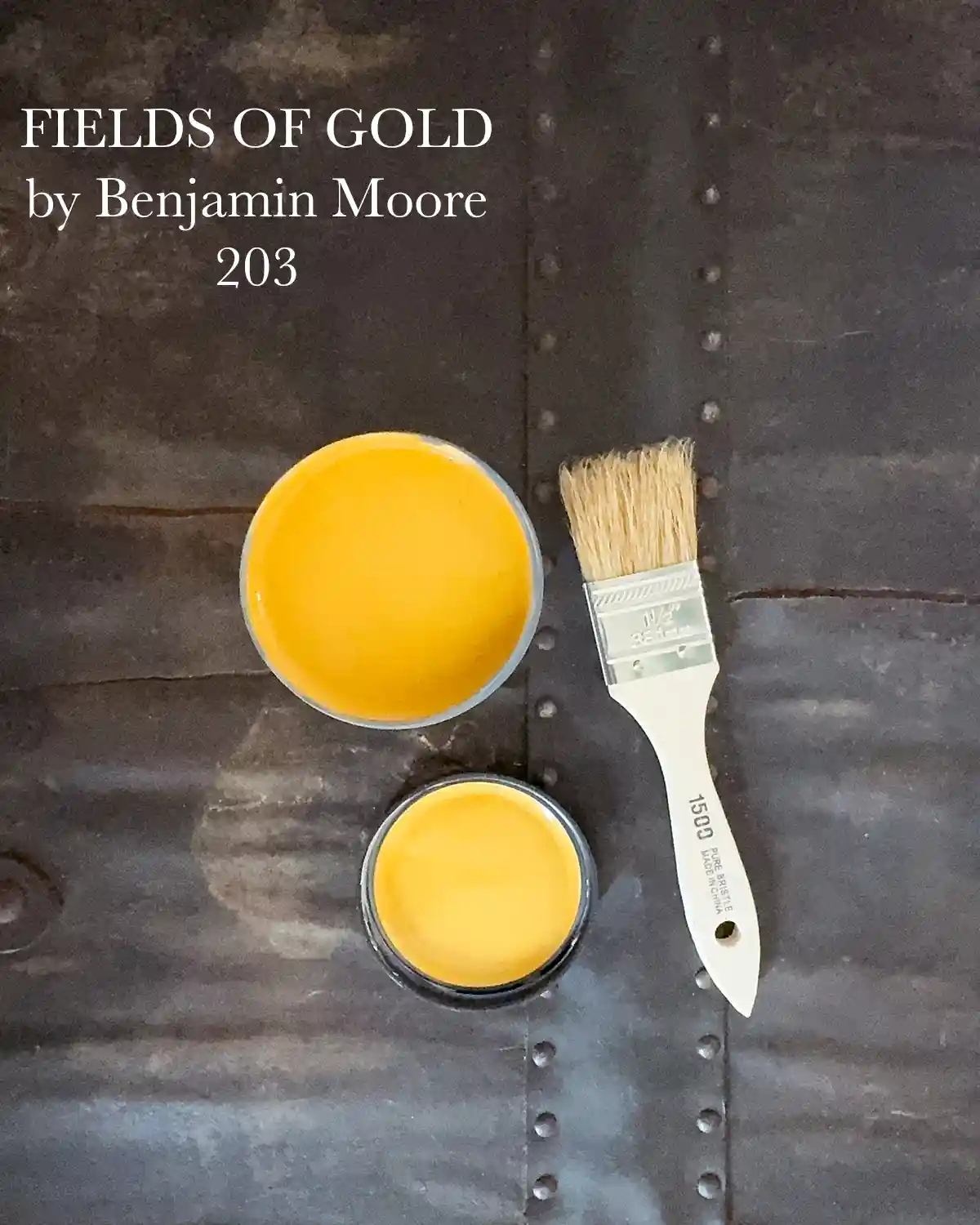
The main accent color we chose is Fields of Gold 203 (Benjamin Moore). The plan is to use this color for the window shutters and the door. It’s a bright yet earthy mustard yellow and one I or the kids never would have picked until we started exploring yellow paint options. It looked so good with Exotic Pink and Salamander, so it stuck.
And Now We Paint
My painting days are pretty limited once fall comes around, but it is my favorite time of year for exterior painting. The sun isn’t beating down on me like it does in the summer. The trade-off, though, is that there’s only about a two-hour window of painting opportunity each day before the dew starts to nestle in. So for the foreseeable future, you’ll find me painting the playhouse every day from noon to two. Wish me luck that I’ll be able to get it done before the snow flies! I’m certainly going to need it.
Also, we’ve been having a severe, historic drought in Vermont for the last few months. We haven’t had rain for most of the summer UNTIL I finally chose paint colors and got ready to start painting. Naturally, there’s rain for the next three days in the forecast. Dang. I should have picked paint colors a month ago when my veggie garden started withering and we worried our well would go dry. Let the painting games begin!